All Posts

To see all flags published, click here.

Oct 29, 2013

Virginia

Sorry for the absence of exact eight months, really! I'll try to post with much more frequence.

Today, the state is the Commonwealth of Virginia, a case of more of the same i.e. a seal on a blue cloth:


[Current flag - Designer unknown, seal by George Wythe and others]

My first idea is a flag in red and blue with a white chevron, resembling the "V" of Virginia:


[Proposed flag - My design]

This flag is effective, but something that bother me is the similarity with the flag of NAVA (North America Vexillological Association). So I adapted it a little, to obtain the following result:


[Proposed flag - My design]

The "V" letter was rotated to make room to the addition of a Phrygian cap, an anti-monarchist and republican symbol, what's a reference to the obverse of the seal (present on current flag) and even appears on the reverse.

My only fear is that the reference isn't as obvious as I suppose. What's your opinion about it?

Comments are welcome!

Feb 28, 2013

New York

New York is a standard American state flag, what means it's below the average:


[Current flag]
The NY state flag had a buff background, what made it almost identical to its neighbor New Jersey. So, in 1901, the background color was changed to blue, and then it became identical to all the others! Yeah, it wasn't a good idea, if you look in retrospect...

But I think New York don't need a downgrade, but a upgrade, and a really thought one to don't regret anymore. For all the NY flag proposals I ever saw, my favorite was made by Jack Expo:


[Proposed flag - Design by Jack Expo]
The colors orange, white and blue came from the Dutch national colors, representing the Dutch heritage, on the time New York region was still name New Netherlands and New York city was still the New Amsterdam. The same Dutch heritage is honored in the current flags of New York City and Albany. The general layout of the flag (specially the blue part) represents the Erie Canal crossing the state. The Erie Canal is one of the few NY symbols that divides and unites the whole state.

Comments are welcome!

Jan 28, 2013

Idaho

Now's time to look at Idaho. See current flag:


[Current flag]
This flag is very uncreative, and therefore too complicated to be an operative flag. It's a blue background with state seal and state name — by the way, have you ever noticed "State of Idaho" is written twice? There are too many details (a tied horse, have you saw?), and too square to American standards.

So, I've came with my own proposal:


[My design proposal]
The charge of the flag is an elk, a symbolic animal of state, present in the seal (inspiration comes from there). The original background was brown, but I decided to put it dark red, the color of the star garnet, a gem only found in Idaho and India, and consequently referential to state nickname, "The Gemstone State". 

Jan 20, 2013

DC and Washington

Washington D.C. and Washington state both took their name from George Washington. How much their flag should look like? Firstly, look at District of Columbia flag:


[Current flag - Design by Charles A.R. Dunn]
This flag I won't change. It's represents the DC incredibly well, and has a very thought origin: it's a rectangular version of the coat of arms (i.e. a banner of arms) of the family of George Washington, that gives the federal district the name.

Now, let's see Washington flag:


[Current flag]
Like DC flag, Washington state flag pays tribute to the USA independence hero George Washington, but in a very lazier way. As nobody wants Washington's face badly conceived on a flag, I think we should work it out. The easiest way to do it is mix Washington arms with state colors, like in these flag by grendelsbayne (very similar to one by Andrew Rogers):


[Proposed flag - Design by grendelsbayne]
This design is outstanding, and could do an excellent Washington flag, but I think I can do something by myself.


[My proposed flag]
A new arrangement, remarkable but still related to Washington arms.

Your comment is welcome!

Jan 5, 2013

Michigan and Minnesota

Some good initiatives started in internet, two of them I cited in Utah and Vermont pages. Today I'll show other two I like too much, one for Minnesota and one for Michigan. First, let's see Minnesota current flag:


[Current flag]
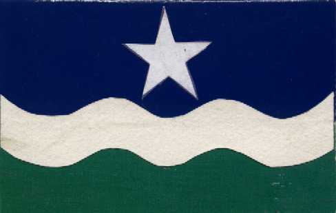
Well, I think it's one of worst American state flags. You can't understand everything's going on at first sight, and it's virtually impossible of being hand-drawn. And, if you tried, how many colors would you use? Seriously, only count the colors is difficult. Fortunately, there's a group of people called "North Star Flag" that are gaining some success:


[Proposed flag - Design by Rev. William Becker and Lee Herold]
Now you can draw and count the colors easily, can't you? See more about the design at . The symbolism is the following: blue for sky, white for winter, green for land, the start represents the "North Star" (state motto since statehood). Know more here. Curiously, it's very similar to one flag to a flag gained a newspaper-sponsored poll in 2001.

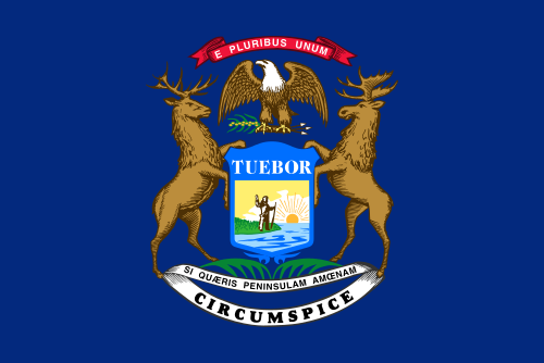
After that, there's Michigan. See current flag:


[Current flag]
The elk and the moose are sympathetic animals, but a flag isn't a good place for them. Only a standard generic flag: a coat of arms or seal in a blue background. Christopher Zervic came with a better design:


[Proposed flag - Design by Christopher Zervic]
Excellent flag, with simple and strong symbolism: the green part with two stars represents the two peninsulas that constitute the state; the five horizontal stripes represent the five Great Lakes (only four of them border Michigan, but whatever). You can see, in my other blog, a design I made mixing this and another proposal to Michigan flag:


[My proposed flag]
Comments are welcome! Access the Vexillology Wiki.

Dec 30, 2012

New Jersey

I wouldn't post my New Jersey flag proposal now because I think it’s not completely done, but I'll post it as a way to propagate the Vexillology Wiki, an initiative I take part with the objective of collect the biggest number of flags proposals to the US states. If you want to share your own flag, mail to vexillologywiki@gmail.com.

Firstly, let’s see the current New Jersey flag:


[Current flag]
It hasn't a blue background, but a buff-color instead. With this exception, it has the same problems of a great part of USA state flags: intricate coat of arms, writings, some generic symbolism (Phrygian cap, cornucopia, Greek goddesses). If you look the previous sentence, you’ll notice coats of arms aren't a great problem; it's their complexity. My first stylization of the flag was a little strange (see Peter Orenski's design for inspiration):


[My proposed flag]
Next to it, I noticed NJ coat of arms's shield isn't a bad one (an obvious reference to state agriculture), it only needs to be simplified:


[My proposed flag]
It’s not bad for me, although the color palette isn't my favorite, but if you think it's too boring, there's a new one, with a reference to Jersey flag (from where the state takes its name).


[My proposed flag]
Comments are welcome.

Dec 23, 2012

Delaware

Delaware was the first state in the federation. Some day I read somewhere wondering why the thirteen colonies, full of history, have some of worst flags. I would consider Maryland, South Carolina and maybe Rhode Island as exceptions. But, as blog subtitle says, "a good flag is not a privilege".

Let's look at current Delaware flag:


[Current flag]
Of course, this buff-color lozenge makes this flag reasonably dissimilar of others in USA, but this coat of arms and the letters don't make it simple, for sure.

My flag proposal is based on a post by Jack Expo, where he pays attention in a very curious fact about Delaware: it was the only colony founded by the Swedes. With that in mind, I come with this design:


[My flag proposal]
The lozenge was extended and used to frame a centered flag of Sweden flag. The background was changed to buff-color, because two shades of blue should be avoided. This blue and yellow shades are (intended to be) the same of Swedish flag, but the blue could be returned to the colors of George Washington's uniform, whatever historians say it was.

Starting from a very similar design, Jack Expo came with its own design. I highly recommends you to confer his proposal (click here to be redirected).

Comments are welcome!